
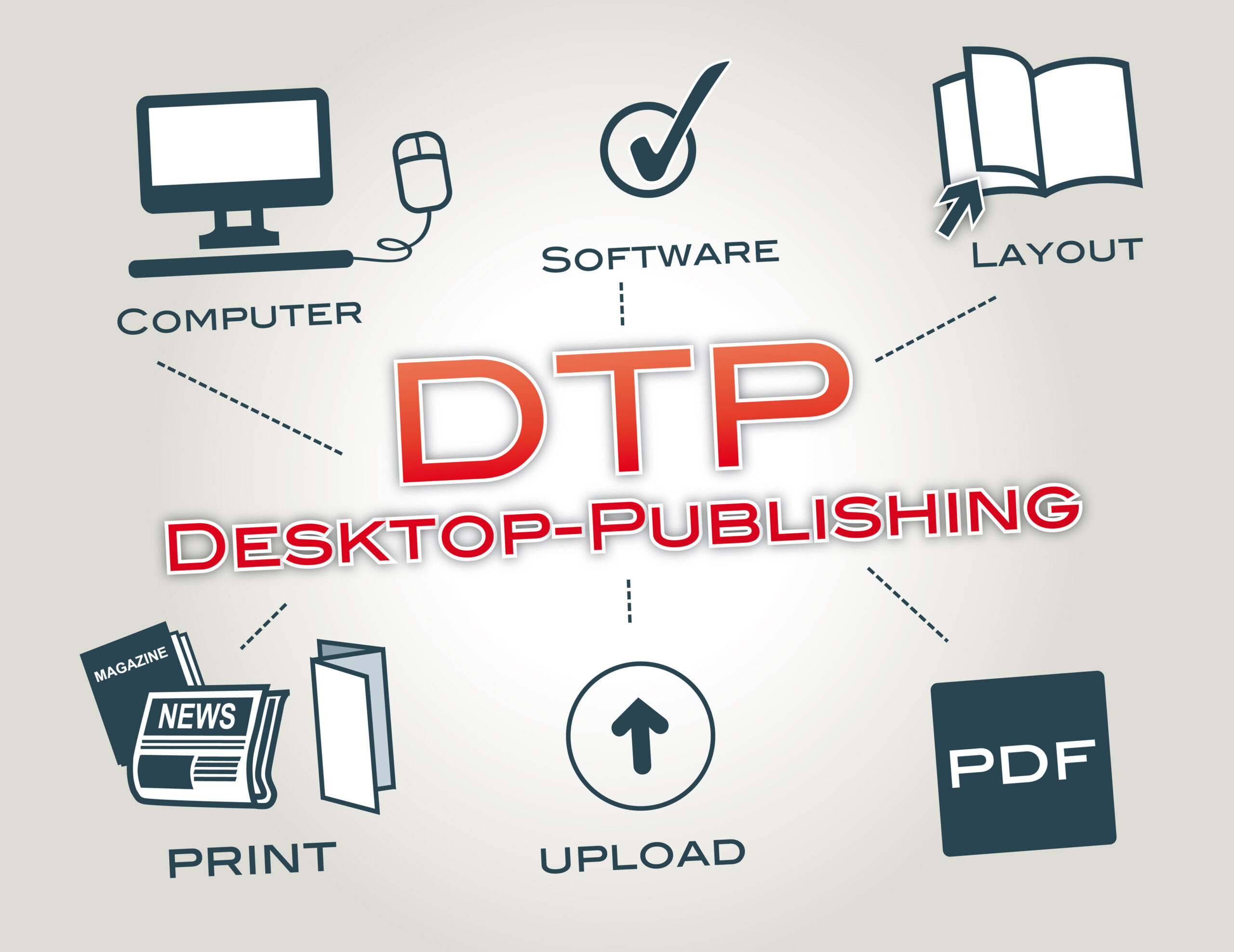
Desktop Publishing Services
Branding/Stationery
Whether you’re sending a newsletter to your customer, a brochure to your clients, or distributing your business card in a seminar, your branding materials should stand out and leave a lasting impression.
Stationery is a broad term that encompasses business cards, envelopes, letterheads, labels, postcards, flyers, brochures, and other similar marketing emissaries. All of which, when designed professionally, can prove pivotal in making your brand shine.
Why our designs stand out?
Every business owner understands that stationery is an essential component of every branding strategy. It conveys a personal, more intimate image of a brand and makes customers feel valued more than ever.
We keep our designs Simple
As is true for most advertisements, simplicity is key. A hotchpotch of design elements only serves to unnerve the reader. Several cramped images, extravagant text, and other overwhelming elements are a big NO. We always strive to keep things simple and straightforward. The trick lies in refining the crudeness of your thoughts and narrowing them down to target audiences.
NEAT AND CLEAN
We Keep your stationery neat and clean so that your brand message is legible and easily comprehensible ― and not vague in any sense of the word.
INTEGRATE YOUR BRAND
Your stationery design should thoroughly represent your brand image. For instance, you can use your company’s logo as the background and as the letterhead to ensure maximum brand exposure. Similarly, you can use signature fonts, colors and images ― if any ― instead of opting for new and unfamiliar design elements.
Remember, your stationery should scream your brand name at the top of its voice.
MAKE IT COLORFUL
Dull, downcast colors like the horrible greys and luster-lacking blacks will destroy the beauty of your stationery.
Color has an immense capacity to evoke emotions. Why was Van Gogh obsessed with the blues and the yellows? These colors were the inspirations behind his paintings because they contributed to his feelings. They governed his moods. It’s utterly necessary to opt for bright and bold colors if you want your readers to feel optimistic about your brand. But, don’t overdo it. A few splashes of vibrant and limpid colors here and there will suffice and give your letterheads a cheery prominence.
DON’T COMPROMISE ON QUALITY
Compromising on quality is one of the worst mistakes you can make. Using cheap, run-of-the-mill materials, instead of spending some extra bucks on thick, sturdy paper, fancy envelopes and state-of-the-art printers is a reprehensible choice. It gives off the message that you’re cheap and unwilling to go the extra mile for your customers. And that is the exact opposite you want them to think.
Stylistic and catchy graphic design
It’s time to grab your audience’s attention through beautifully designed digital ads. Our team of experts will create unique visuals to suit your needs. Advertising with digital tools is highly effective in boosting the awareness of your brand. By using powerful visuals, you can stand out of the cloud on the internet.